Eva’s Little Kitchen
SERVICES ↘
Logo Design, Branding and Collaterals
COLLABORATORS ↘
Joe the Architect, Chris Milne (copy)
A Rebrand Rooted in Culture, Family, and Growth
Rebranding of Eva's Little Kitchen, a local takeout service, to reflect its new upscale physical location, expanding its mission to provide nourishing, family-friendly meals in a warm, welcoming environment.
The brief.
Eva’s Little Kitchen began with a heartfelt mission: to nourish families with meals that are as delicious as they are thoughtfully prepared. The restaurant quickly developed a loyal customer base drawn to its fresh, wholesome approach to food. As the business flourished, it was time for a major milestone—a move to a larger, beautifully designed physical space that could accommodate its growing community. I worked with Eva on a brand identity that honored her roots, welcomed customers with warmth, and stood as a foundation for growth.
The design solution.
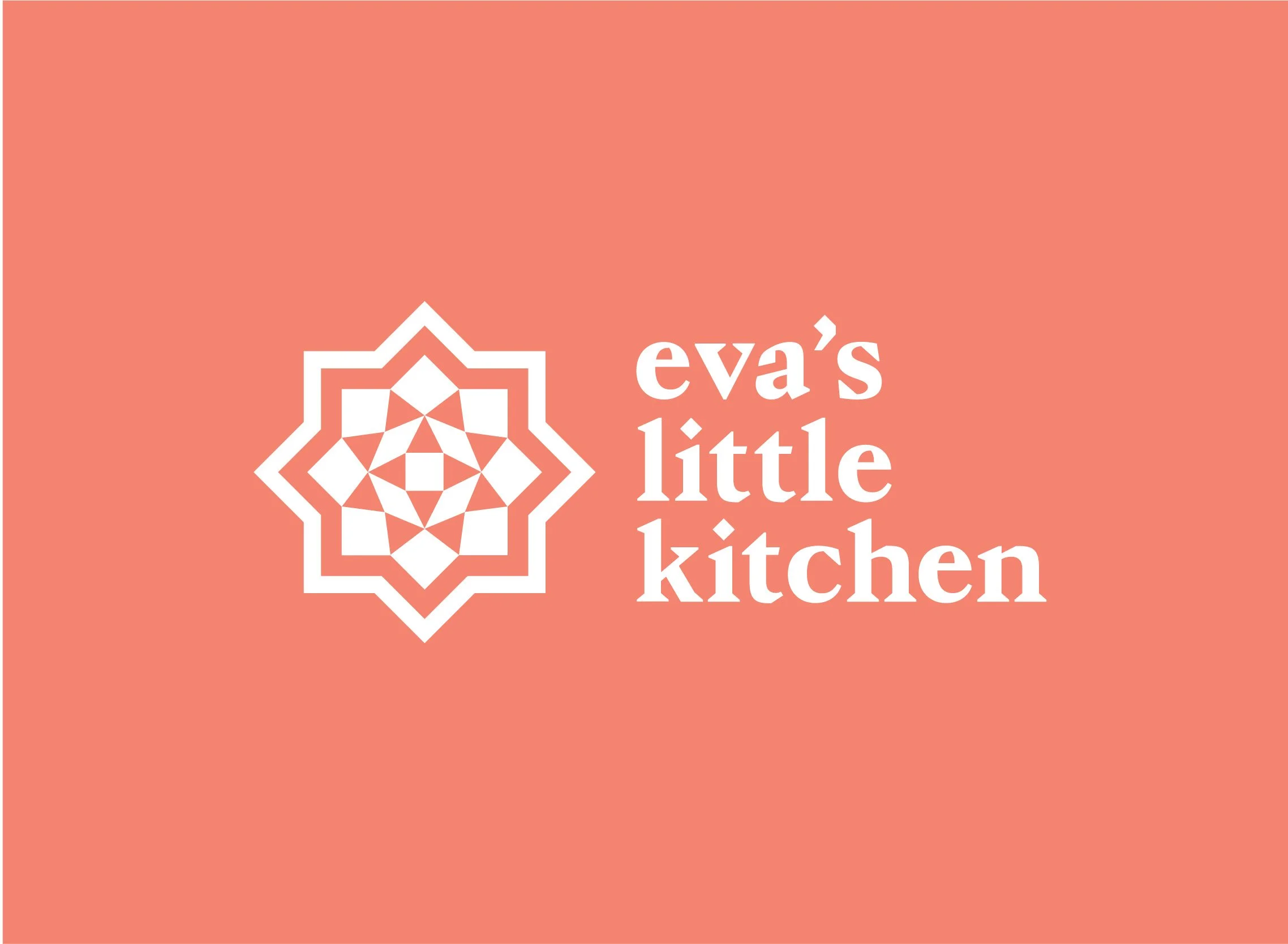
At the center of the rebrand lies the new logo—a design inspired by the eight-pointed Islamic star. It reflects Eva’s upbringing, evoking memories of hospitality and gatherings centered around food. This star pattern is found in everyday items central to Eva’s culture, such as serving trays, pottery, and mosaic boxes. It’s more than a symbol—it’s a bridge between past and present, heritage and modernity.
Every element, from various logo lockups, patterns, a fresh and bright color palette was designed to evoke warmth and familiarity while ensuring the brand feels vibrant and relevant for its growing audience.
Logo before
Logo after